Segment builder V.1
Simplifying complex logic to build a better audience.
The company
Wunderkind is a marketing platform and white glove service which provides personalized, data-driven marketing solutions to businesses across e-commerce and publishing.
My role
Primary UX designer
Team
Product Manager
UX Researcher
Engineers
UX Design lead
Duration
V1: 2 months
May-June 2023
Segmentation tools slow users down
(and piss them off).
Targeting the right people to receive campaigns based on their behaviors and traits is essential to successful marketing. The tricky part is ensuring that configuring this audience is intuitive, painless, and empowering to users.
The brief
I was the primary designer working alongside product managers, engineers, and UX research to create a segmentation tool which would:
1. Communicate with users during setup about the audience they’re building & how they can optimize it.
2. Allow for customizable and complex configurations as well as more simple, guided setup options.
3. Account for potential AI integrations in the future, balancing the ideal state with finite business resources.
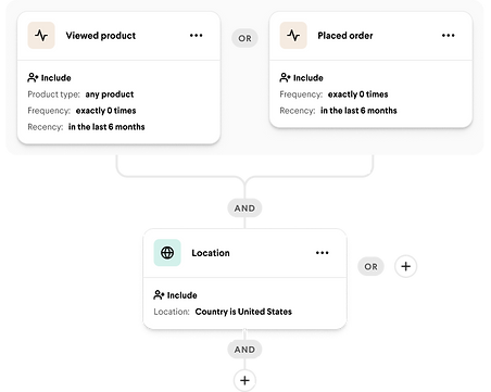
Classic segmentation structure
Robotic language with few prompts.
Hard to distinguish what 'and' versus 'or' means in context.
No indication of how conditions impact the overall segment.
Segment builders don't communicate effectively with users.
Problems for users...
🤔 Accurate boolean logic is difficult for users to both apply and interpret.
Advanced segmentation logic (and/or) is difficult to grasp, nested groups and conditions can be difficult to interpret quickly and accurately.
🗣Wording used in setup often doesn't match the user's natural language.
Advanced segmentation logic (and/or) is difficult to grasp, nested groups and conditions can be difficult to interpret quickly and accurately.
❗️Small errors or inconsistencies during setup can ruin segments.
Segment size and targeting abilities depend entirely on users making no mistakes and..., there is virtually no visibility into these insights currently.
....mean problems for business.
⏱ Increased time to train new hires.
User research showed that managers spend a lot of time training new hires in using segmentation forms, decreasing efficiency.
💰 Greater likelihood of costly errors.
Potential to lose potential conversions as well as costs associated with mistaken sends.
🙅♀️ Risk of client churn from errors and slow turnaround times.
Clients want to start sending & earning as quickly as possible, if identifying and contacting their audience takes too long they will look elsewhere for their marketing needs.
Logic builders are necessary to segmentation (for now) so how can we make them more user friendly?
Balancing the pursuit of a flawless UX with business resources, we had to find the sweet spot where users could both understand and trust the software and business resources wouldn't be squandered.

We experimented with some minor upgrades to the classic structure...
...but we still weren't convinced this flow would really solve the crucial issues our users have with logic builders.
We then looked to a different logic building structure that we know works for our users.
Flow builders are common tools in marketing to show the events leading from point A to point B for a given user when receiving marketing communications.


We can remove a lot of frustration by using a grouping system that makes sense to our users.
1.
Make it visually clear what is included in an 'and' vs what's included in 'or' groupings
We know from past research that users understand the flow builder branched structure style for building logic.


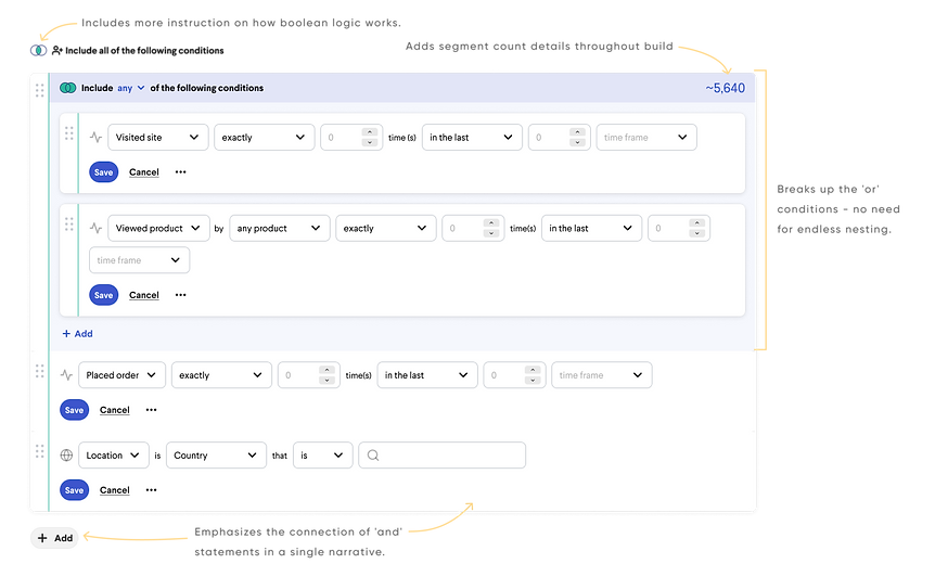
2.
Guide the user through more technical inputs.
In lieu of a natural language input (for now!) we included a more guided input for each condition, bridging some of the gap between robotic language and natural user language.
3.
Give users a visual of the number of recipients in their segment as they build it.
A funnel visual with recipient count connected to each condition allows users to target errors both in specific conditions and in the segment as a whole.


4.
Lay some of the groundwork for AI assistance.
A funnel visual with recipient count connected to each condition allows users to target errors both in specific conditions and in the segment as a whole.
Bonus!
And while we're at it...
save some business resources.
We can kill two birds with one stone - engineering will have to build these components for flows so we save business resources in using the similar pattern twice.


So did users like it?
Yes!
😌
“Having a very easy interface that both the CSM and the client can understand, I think will just also enable clients to hopefully then feel encouraged to send more...if they have an easy, easy interface to do so.”
😍
“I like the visual and I know a lot of my clients like visuals as well.”
🤓
“So visually it kind of correlates to how you would differentiate between and and or in your head.”
🫡
“I love a good flow chart for one and I think that just makes it really easy to see, you know, the journey and like who's gonna see that. So this is definitely like I think easy to review.”
Next steps & future state aspirations.
-
Break out design versions to reflect a multi-phased development process.
Determine V.1 limitations to begin frontend and backend engineering integration
-
Conduct more user testing with clients to ahead of implementation.
Most testing and interviews was conducted with internal staff who are the current users of our software, but because we hope to empower clients to engage with the tool we will need more feedback from them.
-
Incorporate natural language processing when resources allow for it.
Ideally we want to do the work for the user by letting them tell us the story they want to craft and allowing the system to work out the logic part for them.